State Website Redesign
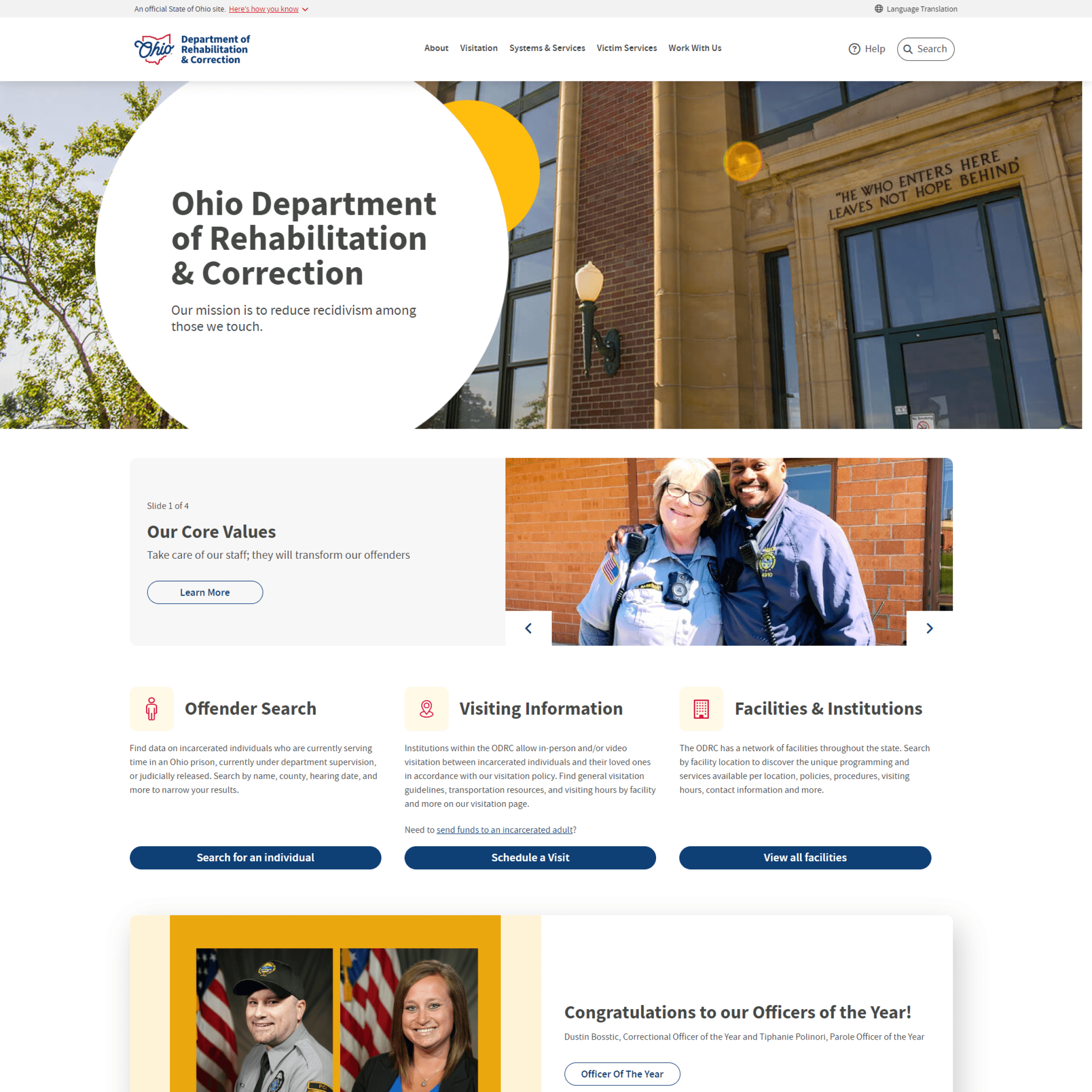
Helping family members connect with incarcerated loved ones.
We kicked off the project by conducting a comprehensive UX and UI audit of Medical Mutual's existing app functionalities. The image you see is a large Miro board filled with screenshots depicting their current user experience, particularly focusing on features slated for development in the first release. This audit served multiple purposes: it helped us pinpoint pain points in the current experience and provided insights into their technical capabilities, aiding in scoping out what could be realistically achieved.
During the audit, we delved into questions such as: What data can they currently extract that would be valuable in the new experience? What data are they unable to extract but would enhance the user experience if incorporated? One significant issue we uncovered was the difficulty users faced in discerning which policy they were currently viewing as they navigated deeper into the details of the app.
This thorough audit formed the foundation of our design process, informing our decisions as we worked towards enhancing the app's functionality and user experience.
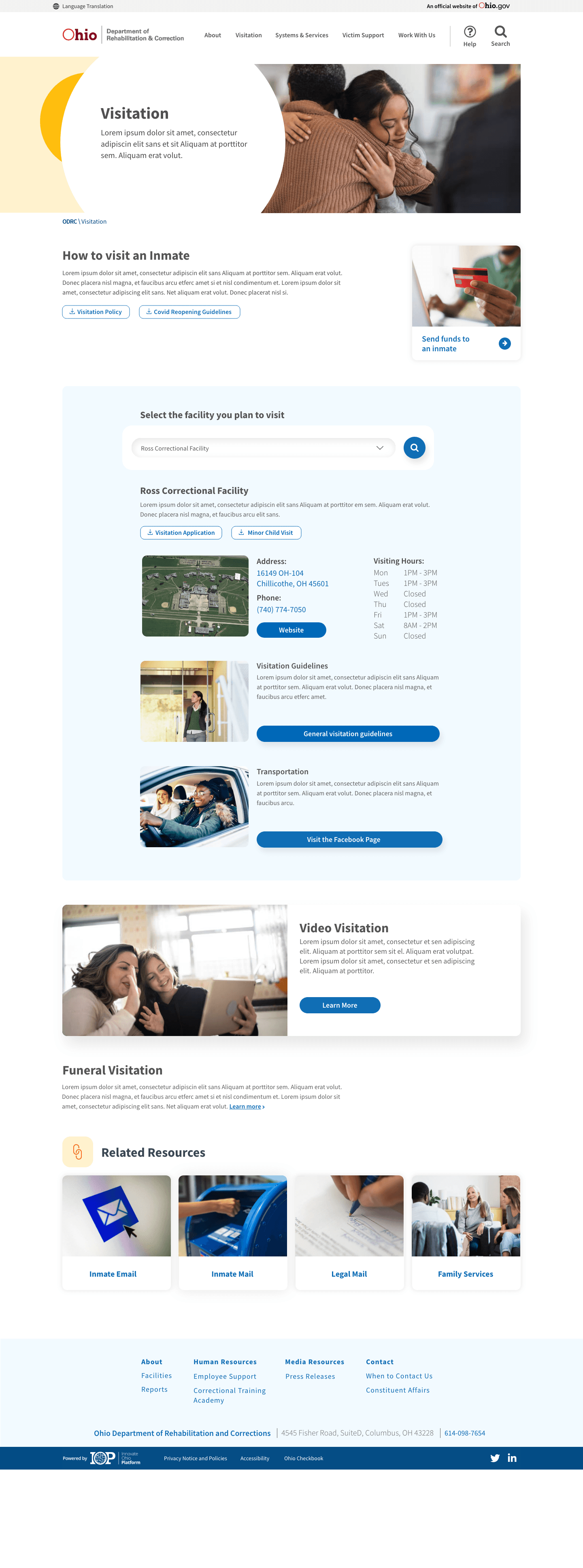
Users come to this site to find out more information about where their loved is incarcerated and how to visit them, As mentioned, this information was previously scattered throughout the site. Our solution to this was to create a one-stop page for this information.
On this page, a user can first find basic information about visiting that applies to all ODRC facilities. Additionally, there are downloadable forms readily available that each visitor must have completed prior to visiting. We also added a quick link to another commonly used and related feature that allows users to send funds to an inmate.
The user starts by selecting the facility where their loved one is currently housed. From there, the page will automatically populate pertinent information specific to the facility and also information that applies to all facilities. Additionally, there is a link to a page that helps those who need transportation to and from visiting their loved one.