Medical Mutual Health Insurance
Our team collaborated with Medical Mutual's UX and DX teams to enhance their app visually while also introducing new functionality and features. Our multidisciplinary team comprised project managers, researchers, UX and UI designers. On their end, they had VP-level stakeholders, developers, scrum masters, a DX team, and more.
As a UX designer, I worked closely with a UX lead, while also spearheading the UI efforts alongside three additional UI designers. I personally designed the prototype and the UI for the screenshots provided below.
The app updates were divided into three releases. The initial release focused on revamping the authentication flow, ID card access, implementing a multipolicy access framework, displaying accumulations, profile settings, and introducing a policy dashboard.
We encountered several challenges during the project:
How to provide the best experience for users with multiple policies, ensuring easy access to relevant information.
Enabling users to quickly access their most frequently used functions.
Determining which data is essential and the optimal way to display it.
Crafting a seamless experience for users with a mix of native and single sign-on (SSO) features.
We joined the project after Medical Mutual had already made some progress, but we soon identified issues with their research and significant gaps in user flows and requirements. Given these findings, we paused briefly to reassess, obtained approval for updated timelines, and began addressing the identified issues.
We kicked off the project by conducting a comprehensive UX and UI audit of Medical Mutual's existing app functionalities. The image you see is a large Miro board filled with screenshots depicting their current user experience, particularly focusing on features slated for development in the first release. This audit served multiple purposes: it helped us pinpoint pain points in the current experience and provided insights into their technical capabilities, aiding in scoping out what could be realistically achieved.
During the audit, we delved into questions such as: What data can they currently extract that would be valuable in the new experience? What data are they unable to extract but would enhance the user experience if incorporated? One significant issue we uncovered was the difficulty users faced in discerning which policy they were currently viewing as they navigated deeper into the details of the app.
This thorough audit formed the foundation of our design process, informing our decisions as we worked towards enhancing the app's functionality and user experience.
Mapping out the products, features, and capabilities was crucial for understanding the flexibility required in our components to accommodate the diverse range of policies and functions offered by MedMutual. For instance, while some policies may not include ID Cards (like life insurance), or a group medical policy might not allow payments directly from the insured employee. These features are significant and needed to be prominently featured in the user experience. However, designing for such a wide array of products with varying features and capabilities presented a challenge.
By mapping out this information comprehensively, we gained a clear understanding of all the factors that needed to be considered during the design phase. This enabled us to develop a flexible and adaptable design system that could accommodate the different needs and requirements of MedMutual's various products and policies.
After completing the UX and UI audit, we shifted our focus to crafting user stories for each new feature we planned to implement. Our approach involved understanding what users wanted to accomplish and why. For instance, while current customers could view their ID cards using the app, through user stories, we identified additional functionalities that could benefit users:
Save ID cards to their digital wallet.
Email ID cards to a healthcare provider.
Save ID cards to their device and share them via other means, such as iOS sharing options.
Allow primary policyholders to view and manage the ID cards of dependents.
Enable users to view ID cards offline and without being logged into the app.
We explored user stories for each of these five features, aiming to enhance the app's utility and user experience. However, before diving into the design phase, it was essential for us to gain a thorough understanding of all the products offered by MedMutual, along with their various features and capabilities. This foundational understanding would ensure that our designs aligned closely with the company's offerings and user needs.
From there we began to map out various user journeys as they pertained to the features and user stories. At this point, we began designing based on our solutions.
Here are some key observations about the prototype and images provided:
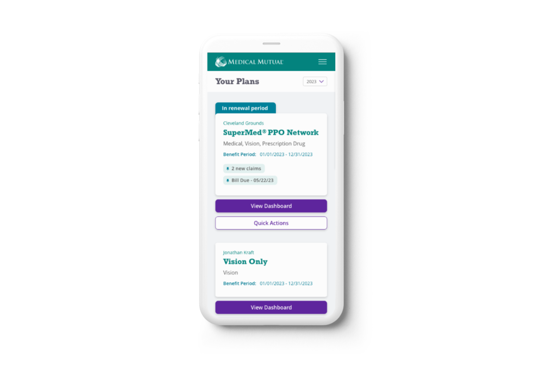
Flexible Cards on Home Screen: The cards for each policy on the home screen are designed to be extremely flexible, accommodating various types of information and functionality offered by each plan. Call-to-action buttons (CTAs) on these cards, as well as additional functions accessible via the three-dot menu, are adaptable. This allows users to quickly access commonly used features without unnecessary navigation.
Enhanced ID Card Experience: Instead of requiring users to zoom in on an image of a physical ID card, key information is prominently displayed at the top of the screen for easy access and wayfinding. Furthermore, all information on the card is organized within an accordion, enabling users to quickly browse and even copy/paste relevant details.
Abundant Functionality from ID Card Page: Upon accessing the ID Card page, users have a plethora of functionality at their fingertips, allowing them to access and share their card and information in various ways. This streamlined approach enhances user convenience and accessibility.
Comprehensive Plan Dashboard: Upon navigating deeper into a plan from the home screen, users land on the plan’s dashboard, where a wealth of information is readily available and easily accessible. This centralized hub provides users with a comprehensive overview of their plan, facilitating informed decision-making and management.
Following user testing, we implemented four key changes based on user feedback:
Shortened Onboarding Flow: Users expressed a desire to expedite the onboarding process and get into the app more quickly. Therefore, we streamlined the onboarding flow, deferring optional settings such as Multi-Factor Authentication (MFA), going paperless, or text communication for later stages.
Improved Plan Card Navigation: Users found it challenging to understand that the plan card was clickable, leading to confusion when accessing the plan dashboard. To address this issue, we added a prominent "View Dashboard" button and relocated additional functionalities such as viewing claims under a "Quick Actions" button for clearer navigation.
Enhanced Visibility of Balances: The "Balances" section was elevated to provide it with more prominence, reflecting its importance to users. Additionally, we adjusted the styling of "Member Tools" to reduce competition with "Claims" and "Balances," as these were identified as the most frequently used features in the app.
Improved Access to Definitions: Users found it difficult to access definitions under "Balances" using the original information icon. To enhance usability, we moved pertinent definitions to each card, ensuring easier access and understanding for users.